Product Type
Scalable Feature (B2C)
Platform
Mobile
TIMELINE
1 week (2024)
PROBLEM
Overwhelmed by Data
People managing shared expenses across multiple users, categories, or merchants often struggle to keep track and divide costs accurately within existing financial tools.
SOLUTION
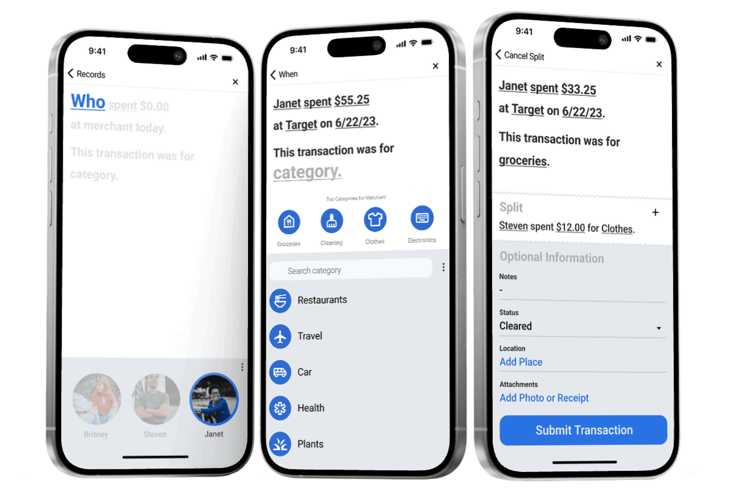
Interactive Sentence Builder
Replacing the traditional tabular format with an engaging, interactive, sentence-based interface allowing users to follow along and fill in details intuitively.
BACKGROUND
A Modified Design Sprint
This was a 1-week solo project where I used a modified version of a design sprint. The focus for this case study came from a personal challenge I encountered while searching for the perfect budgeting app.
CHALLENGE
Balancing Clarity and Engagement
Designing an interface that simplifies complex financial information while maintaining user engagement, making it easy for users to track and split expenses without feeling overwhelmed by data.
Using my experience with multiple budgeting apps, I made this
end-to-end journey map to find the most critical step for users.
MARKET ANALYSIS
Identifying Gaps in Existing Budgeting Apps
IDEATION
Splitting My Attention
Using a the Crazy 8's design sprint method, I pushed for wide variety of solutions.
Listing information fields to input
Using a photo of a receipt for A1 to input fields automatically
Advanced version of #2, more features and fields
Organizing visual hierarchy
Adding a gallery to #4
Focusing on splitting categories
Going back to #1 but adding splitting categories
Combination of everything, and adding a different layout
STORYBOARD
Starting with the Boring to Get Splitting Right
REVISED STORYBOARD
From Spreadsheets to Interactive Sentences
I aimed to improve user experience and engagement by replacing the traditional tabular format with a visually appealing, interactive interface that uses a sentence format, allowing users to follow along and fill in the blanks.
USER TESTING
Navigating Negative Feedback
Even though the five users that I tested didn’t favor the splitting function during this test, I decided to keep it because I believe the splitting feature might have been misrepresented and could be very useful to others if I had tested it with more people.
Since this feature is the main focus of my project, I felt it was important to refine and continue with it, despite the initial challenges.

USER FEEDBACK
Improving Usability
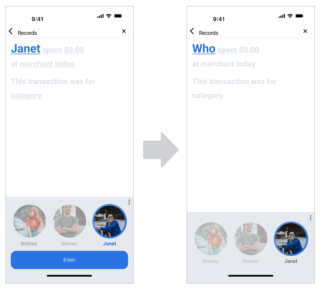
"The size of the word ENTER was too small"
Users hesitated after selection, unaware the button had to turn blue.
"Change the word to match the function"
It appeared that there was a lack of clarity in interpreting the button.
"Excessive ENTER buttons"
60% of the users mentions there were too many "enter" buttons to proceed.
"Change the date to a numerical format"
80% of users preferred seeing the date instead of the word "today" or "yesterday"
FINAL DESIGN
Starting with the Boring to Get Splitting Right
IMPACT
A Successful Learning Experience
This project addressed a gap in existing platforms by enhancing the management of user segmentation, categories, and amounts. It introduced a structured approach to distributing inputs across different stages of the flow, expanding usability beyond individual users.
This concept serves not only as a standalone project but as a study in how existing platforms can implement collaborative expense tracking to reach a broader audience and foster shared financial management.


